THE 7 ELEMENTS OF GOOD GRAPHIC DESIGN
The Elements of Good Graphic Design are the components or parts of a work of art or design. More simply put, they are the ingredients of art. Take one part color, a pinch of texture, and a whole lot of shape and the result will be some well designed graphic design.
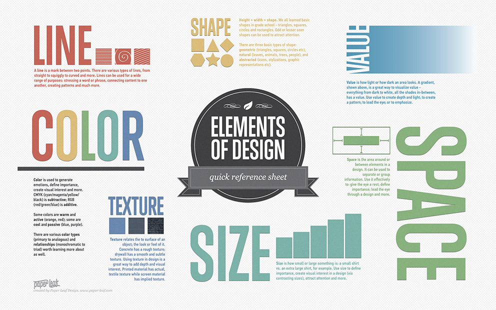
Recipes may vary, but all works of art and design contain a combination of the following seven elements shown in this infographic:

LINE:
Lines, in graphic design, can be used for a wide range of purposes: stressing a word or phrase, connecting content, creating patterns and more.
COLOUR:
Colour is used to generate emotions, define importance, create visual interest and unify branding.
TEXTURE:
Texture relates to the surface of an object. Using texture in graphic design adds depth and visual interest. This can be applied graphically in the form of pattern or through the choice of printable surface.
SIZE:
In graphic design, size is used to convey importance, attract attention and create contrast.
SHAPE:
The three basic shape types are Geometric (Circles, Squares, Triangles etc.), Natural (leaves, trees, people etc.) and abstract (icons, stylizations and graphic representations). Use carefully to create a visually pleasing design and eye-catching design.
SPACE:
A vital part of any good graphic design, Space is the area around the elements in a design. It can be used to separate or group information. Use it effectively to give the eye a rest, define importance and lead the eye to where you want it to travel.
VALUE:
Value is how light or dark an area looks in a design. It is everything from the darkest of blacks through to the brightest of whites. Used correctly it will create depth, contrast and emphasis.
If you’ve enjoyed this blog, we think you’ll enjoy reading our following post too